
WinFactor, LLC
Communications Associate
Winfactor is an invoice factoring management system that offers multiple services to transportation companies (also known as Factors.) Businesses are able to purchase invoices from them while the system does all of the work, including calculating, tracking, giving detailed reports, and posting receipts.
As the Communications Associate, my goal was to keep the Factors informed about the new features and changes to WinFactor and its many portals. I informed them through Academy articles and marketing emails. I also created a couple of new features to the Academy; I coded bar charts and pivot grids showing client and customer interaction.
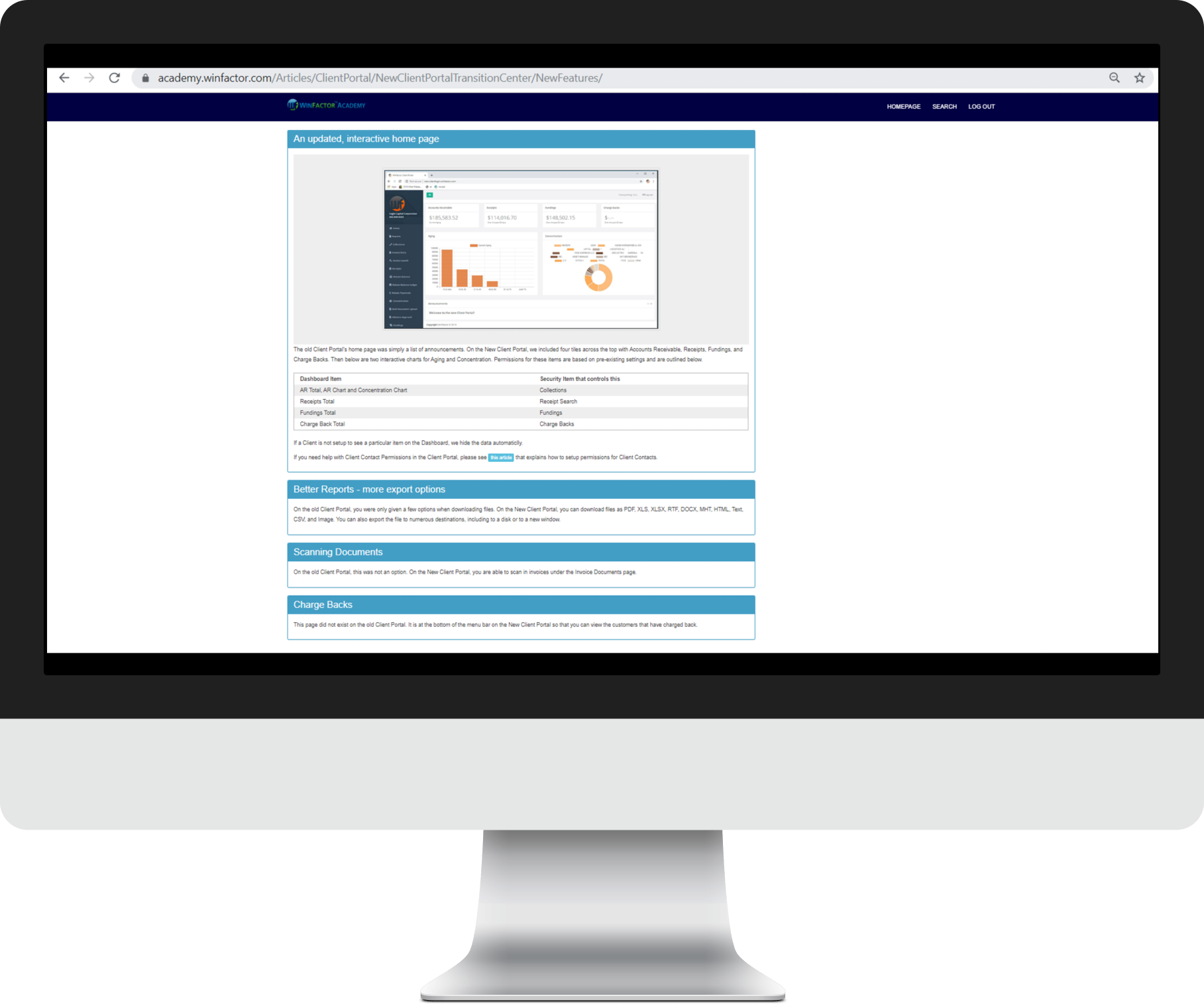
One of the portals WinFactor has is their support website, the Academy. Factors (transportation companies) have access to this site so they can view step-by-step tutorials on how to perform certain tasks on WinFactor and the other portals; the Client Portal (app, desktop website, and mobile website,) and the Customer Portal. The tutorials are divided up by subject under the Articles section of the website. I created eighteen articles for WinFactor by coding them in HTML on Microsoft Visual Studio. Some of the content included screenshots edited on Adobe Photoshop, links, buttons, pop-ups, and panels. Below are screenshots of some of the articles.


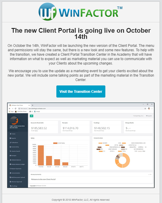
When an article was created, I would code a marketing email and send it out via SendGrid to WinFactor’s 300+ users. Like an article, the email included images edited on Adobe Photoshop, buttons linked to the article, dividers, and promotional text. Below are screenshots of some of the emails.


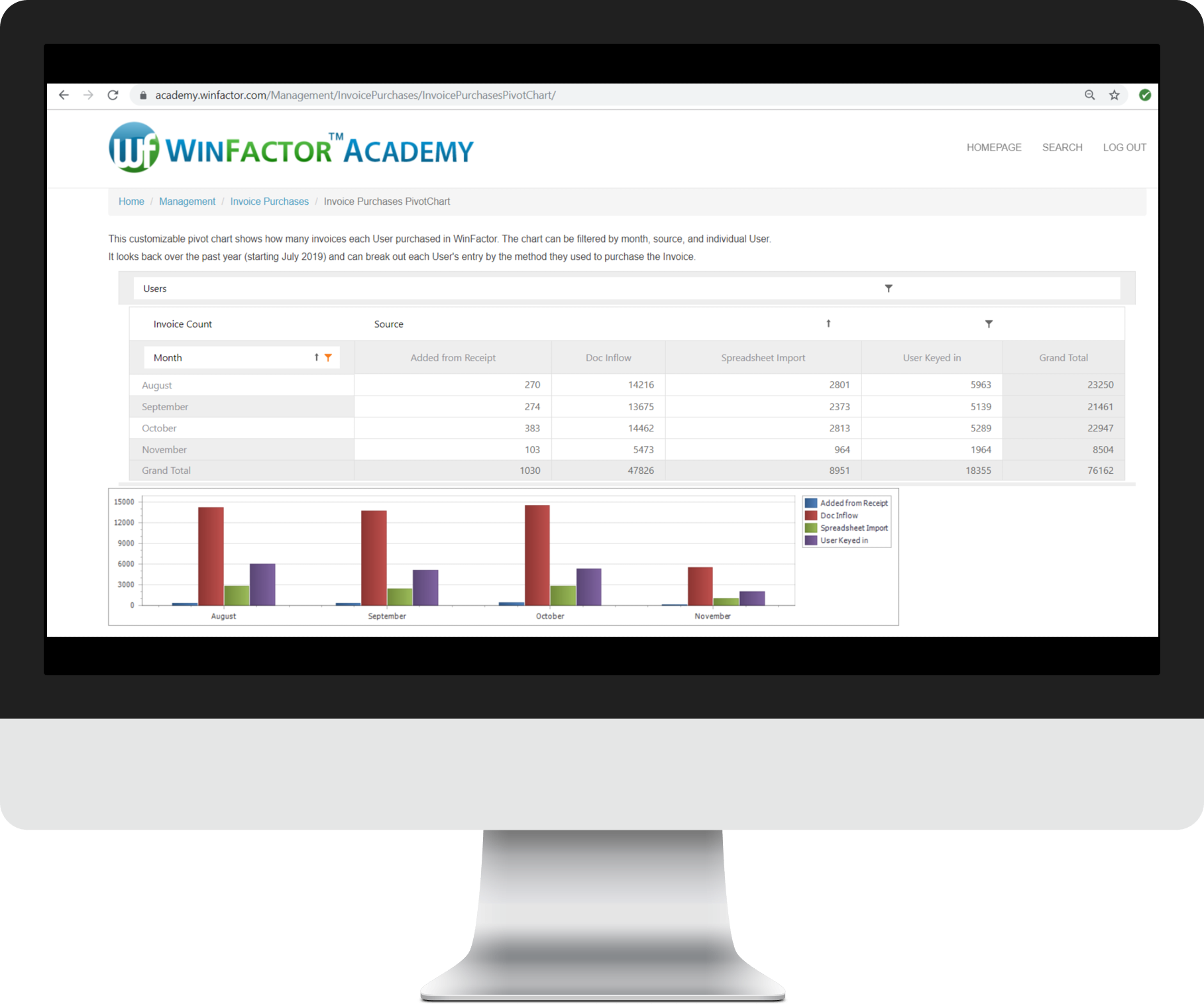
Finally, I created a new feature in the Academy called the Management section. It allows Factors to visually see their clients and customers interaction. Pictured below are two bar graphs and a pivot grid/chart. They were created using DevExpress tools and edited in HTML.
- The first (stacked) bar graph shows the Factor their company’s purchased invoices by user and source. The users’ names are covered for privacy reasons.
- Like the first graph, the pivot grid shows the purchased invoices, but allows the Factor to choose the data they want to see. In this case, they had three fields to choose from, Month, Source, and User. They could also filter each field (for example, selecting the recent three months instead of all of them.) When a data field is moved or filtered in the grid, both the grid and pivot chart adjust. The current grid shows the amount of invoices purchased over the past four months, divided by source.
- The second bar graph shows the number of logins the company’s clients have had over the past few months, divided by the portal they used.


One other task I accomplished was uploading the iOS Client Portal app to Apple’s App Store. I had to upload the current build of it on Xcode, send it to a group to test it out, submit the app for review (this is where I had to fill out all of its information including screenshots on four devices, a description, contact information, and rating,) and submit the app again when we had a new version.